Changelog
See what's new added, changed, fixed, improved or updated.
Component Sync Unified Library Management (Beta)
We’re launching Component Sync, a new way to manage, version, and update all your shadcn components across projects with a single click.
Now you can:
- Sync shared components instantly between multiple apps
- Track version diffs and apply updates selectively
- Automatically resolve dependency conflicts
- Sync All button for project-wide updates
- Component different viewer with inline changelog
- Scoped sync choose which namespaces or folders to update
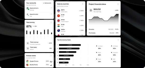
Studio Dashboard Live Preview & Deployment
The new Studio Dashboard brings together everything you need to preview, test, and deploy your component library right from your browser.
- Preview components in any framework (Next.js, Remix, Vite)
- One-click deploy to Vercel
- Real-time preview links for teams
 Vite
Vite React
React Angular
// Example of updated API usage
const agent = new AIAgent({
  model: "Shadcn/studio",
  reasoning: "enhanced",
  multiModal: true,
});
The Studio Dashboard is a powerful tool within shadcnstudio that streamlines the process of designing, previewing, and deploying your component library. It allows you to instantly preview components in different frameworks (like Next.js, Remix, and Vite) directly from the dashboard.
- Live Preview mode instantly test UI changes inside the dashboard
- One-click Deployment push updates to production without leaving Studio
- Multi-environment support manage dev, staging, and production easily
- Multi-environment support manage dev, staging, and production easily
Design Tokens 2.0 Global Theme Rebuild
We've completely redesigned the theme system for Design Tokens 2.0. Tokens are now hierarchical, semantic, and fully type-safe — built for scaling design systems.
Design Tokens 2.0 introduces a complete overhaul of how themes are managed within shadcnstudio. With this update, design tokens are now hierarchical and semantic, offering greater flexibility and scalability for your design system.
The new system supports automatic dark/light theme pairing, making it easier than ever to maintain consistent visuals across all environments. Tokens for colors, spacing, typography, and more are now fully type-safe and easily customizable, ensuring that your design system can grow alongside your projects.
Read More- Complete token overhaul unified color, spacing & typography system
- Preset Themes instantly apply predefined light/dark palettes
- Global token inspector view & edit all tokens in one place
- Preview share links generate temporary links to share progress with your team
Need Help? We've Got Answers
Explore Our Most Commonly Asked Questions and Find the Information You Need.
Ready to Dive Deeper?
Everything from setup to advanced features is covered in our docs.